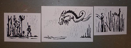
Proof prints of the Jabberwocky carving. If I was going to mat this, I would mat right up the the edge of the images so that there was no white edges; the image would flow better without the white.
Made a blue background (its shiny :D ),with the gelli-plate and then used the lino like a giant stamp.
And a red version, which I think works better. The blue looks a bit too washed out for me.
I agree with Cindy Lane, orange always makes me think Smaug, it must be the echo of the book illustrations in The Hobbit!! I like the blue best but I can see that the red is more striking.
My poor neglected blog! I just keep forgeting and running out of time in the day to post anything. I will try to post at least a few times a week *crossign fingers*


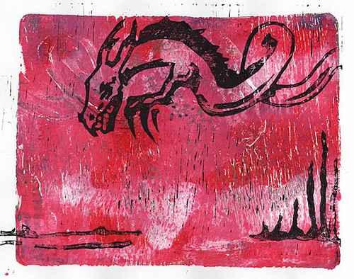


I like the Red better too :)
ReplyDeleteThe red has more impact, and I think it fits better with the story you are trying to tell. Nice work! :)
ReplyDeleteyeah, thats what i thought :) thanks :)
DeleteYep
ReplyDeleteI'm with the others - the red has more impact. The blue would work well with a Nessie type rather than a dragon I think.
thanks sue :)
Deleteand now i want to make a nessie print :D
DeleteWow! Loving the red! DId you try any with an orange hue? I always thing Smaug when there's an orange-y dragon around.
ReplyDeleteI agree with Cindy Lane, orange always makes me think Smaug, it must be the echo of the book illustrations in The Hobbit!! I like the blue best but I can see that the red is more striking.
ReplyDeleteI love what you've done with the jelly and lino combination! Wow!
ReplyDelete