More Alcohol
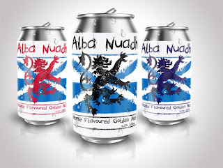
Was suggested these were too Scottish looking and the more I look at them, I totally agree so back to the drawing board to try to bring in something Canadian to them.
Of course when people think of Canada they tend to think of maple leaves, but the only problem with that is that the maple leaf is used on a lot of Canadian alcohol labeling already so can't have something that looks too much like something else already on the market. But now the design does go better with the maple beer idea.
I will probably move the text up slightly, I think its a bit too low on the cans. But I do think its a good mix up between Scotland and Canada.
I am probably going to use cans for the design but just wanted to see what it might look like on bottles. This project is going to give me more grey hair lol


Too Scottish looking????? I grinned reading that. The maple leaf certainly got rid of that.
ReplyDeleteI like what you came up with. I seem to like everything you do!
These designs are awesome (as usual). Like Julie, I am also a fan of yours!
ReplyDeletethanks Julie :) yeah it didn't really look like it had any Canadian influence to it at all.
ReplyDeletethank you very much Chris :)
I like both of the designs, I think they have a great color balance and are interesting. You're doing wonderful work!
ReplyDelete