
Reid Park
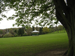
reid park1
Originally uploaded by fuzzydragons
Short walk today to try to build up my knee and hip from the relapse. That and it looked like it was going to rain (but never did :/). This is part of Reid Park. Gifted by this guy. Nice park to take a walk around on a good day. Once my knee is up to the challenge I will walk around the park and back up to the war memorial. Would now, but don't think Mr.F would be able to carry me down the hill :p
 Copyright Jennifer Rose Phillip
Almost finished after 3 hours today :/ lol *crosses fingers* that this gets down tomorrow (still needs work on his chin). Taking a little bit longer then it should. I need to work on being faster if I am ever going to go anywhere with coloured pencils.
Since I haven't been able to really draw this past week I spent most of the afternoon drawing out some ACEOs and working on this to play catch up. I did spend the week making notes about what I want to change with my website. The site has been long neglected and needs some updating. I like the layout of the site, they way the galleries are set up (just needs a bit of tweaking), the general look of the site I like. I think the graphics just need to be updated. I honestly want to know what people would change for my site. If anyone wants to have a look please do :) www.fuzzydragons.co.uk It needs a major art update which I am hoping to get done in the next week. I really think that a bit of a change might be good.


That horse head is looking lovely!
ReplyDelete(And I can never keep caught up with all my various projects and aspects of *life* either!!)
Hi! My only criticism would be that when I access your blog from your site I can't read it without moving the arrows at the bottom from side to side (technical language, hahaha!) so I find it easier to go straight to your blog via your profile page. This is probably only a problem for people with old computers like me, lol!
ReplyDeleteThe park and the horse look great! Don't push yourself too hard my dear, you're doing great as it is and you don't need to put yourself under extra stress. Take care :) xxx
OK you asked for it... hehee.
ReplyDeleteNo seriously, I'm going for the objective-as-possible, first-impressions critique here okay?
- Black is hard on the eyes on a screen, as an overall background (as is most dark colored backgrounds hence why majority are light) as it can have a sub-conscious effect on viewers.
- Love the images/graphics in the top banner
- The top links (News, etc) could be a lot smaller as they are fighting for prominence on the overall page, but you want the banner and the main body of it to be the focus.
- If there's a way to get rid of the two scroll bars? (another subconscious navigational thing people don't do well with on websites) maybe by making the main frame bigger?
Hope that helps? It's good to play around with things, keeps it interesting to you and the readers!
Jennifer, I've never seen a site like that. I think it's awesome that you've pulled everything in together like that. Very clever!
ReplyDeleteTwo thoughts...and neither of them are very "strong". One, I'd think about making the journal (this blog) two columns again, so it fits in that window without a horizontal scroll. Two, I'd think about making the blog a dark background to fit in with that site better.
But, as I said, neither of those is very "strong" I can think of good reasons to not do either! :D Just food for thought.
Your horse is looking great!
ReplyDeleteOn your site, I agree that the scroll bars are a bit cumbersome but like Rose mentioned, it's cool that you have everything all together that way. But I don't know enough about web design to offer a different solution:) Normally with blogs I, too, find black backgrounds difficult to read. But on your site with minimal text, the black really makes the art pop so I would probably keep it that way.
I hope you are starting to feel better! Love the horse... You are amazing with any kind of pencil!
ReplyDeleteThe horse is looking great!
ReplyDeleteAbout your website, I have to say, I don't really like black! Why not a dark grey? Or a mossy green, like the fuzzydragon face ... I don't like the slime green font colour, I would prefer if you used a similar colour to your fuzzydragon, like peaches and pinks.. but maybe that's just me being too girly!
Hope you start feeling better soon. Love your horse.
ReplyDeletethank you tara :)
ReplyDeleteBlack Cat- thank you for looking :) its good to know what someone doesn't like, not everyone has new computers or fast dial up either. My knee seems to be recovering so can walk a bit farther each day :)
Jenaveve- yep I asked for it :D its all helpful and will be taken into consideration :) thanks!
rose- hubby did it for me lol I am lost when it comes to code. I thought about making the journal 2 columns, but need to figure out what parts of the sidebars have to go. Don't think having all of them will look right.
Ann- thanks :D ok another negative for the bars. I do like the black as I think it goes well with the art, but if it really bugging peoples eyes it might have to go :/
Michelle- thank you :D feeling a lot better now (ears are still ringing tho :/)
nuvonova-thanks :) ok another not for black :) I did have it a light pastel green for a bit but I had a few people comment on that it was hard to read even tho it went well with the graphics.
thanks Shashi :D
Now I'm feeling weird for liking black backgrounds. You can't please everybody.
ReplyDeleteI feel your pain about the speed of pencil...it takes forever but gives back something special. Beautiful work, will it be done on time?
ingrid- i like the black too tho so your not weird. I should have had it done last week to put in my portfolio but then I had the relapse so that went out the window :/ hopefully done tomorrow (seems like I've been saying that for weeks :p)
ReplyDelete